A smart food ordering platform which not only enables restaurants to accept orders via their online channels (Website and mobile apps) but also provides various features to re-engage and re-target their customers to create brand recall and increase the order volumes with proper analytics.
I was recruited as a product design intern at Dineout& was given the opportunity to collaborate with the design team on the product's B2B side.We created a smart order processing platform for restaurants.
Problem Statement
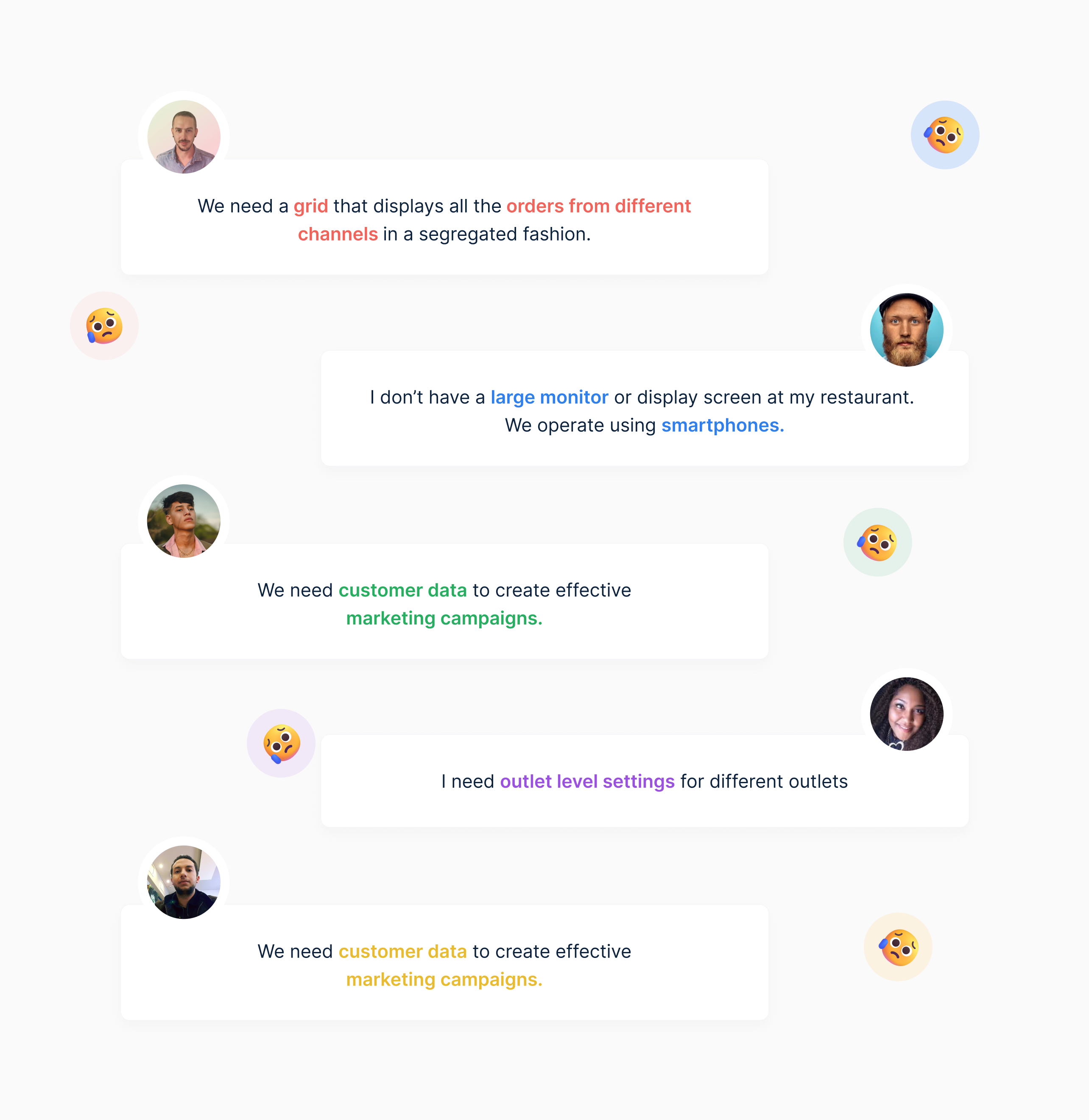
Restaurants were not able to handle and process large volumes of orders. They were accepting orders from multiple online channels like zomato, swiggy, dunzo which created confusion and resulted in wastage of time, resources & wrong delivery.
My Contribution
I was recruited as a product design intern at Dineout & was given the opportunity to collaborate with the design team on the product's B2B side. Our end goal as a team was to create a smart order processing platform for restaurants. My part in this was to create order processing flow & order history flow for the system.
Challenges
On a busy day, if you were to take orders digitally using a information loaded software, there is a potential that you would make an error in the order details.
This exactly was our challenge to make the system clutter free, seamless and intuitive.
There was another challenge which was little personal. I had no knowledge about how restaurant ordering systems work. However, I tackled it somehow.
Research & Planning.
User Interviews
A total of 11 User Interviews were conducted to gain empathy for users who were mainly restaurant staff and owners. We also tried to figure out what type of structure and layout is preferred by them.
We Interviewed restaurant owners and managers and asked them about their frustrations on a busy day while taking orders. Some of them are listed below.
Competitive Analysis.
I analyzed the competitors and compared them on the following criterion-
1️⃣ Fee
2️⃣ Logistics
3️⃣ Customer data
4️⃣ Discounts
5️⃣ Loyalty

Jumping off to the design part.
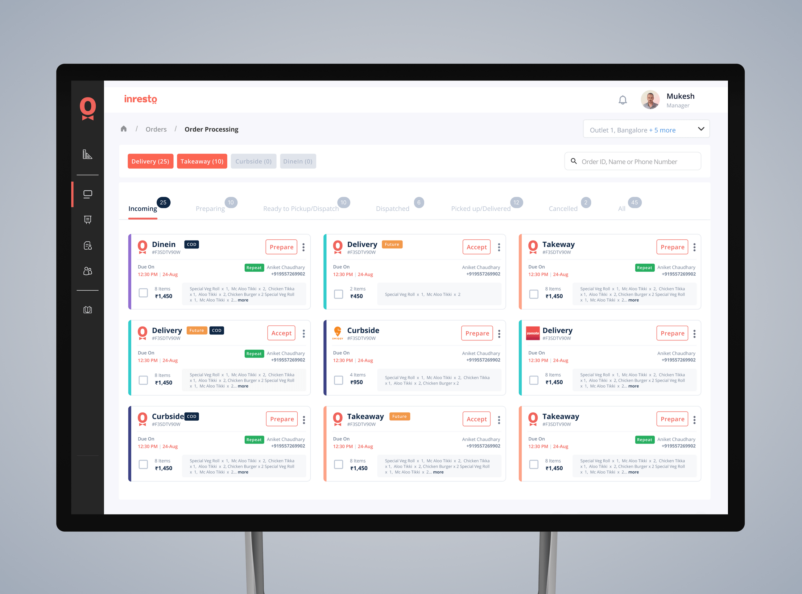
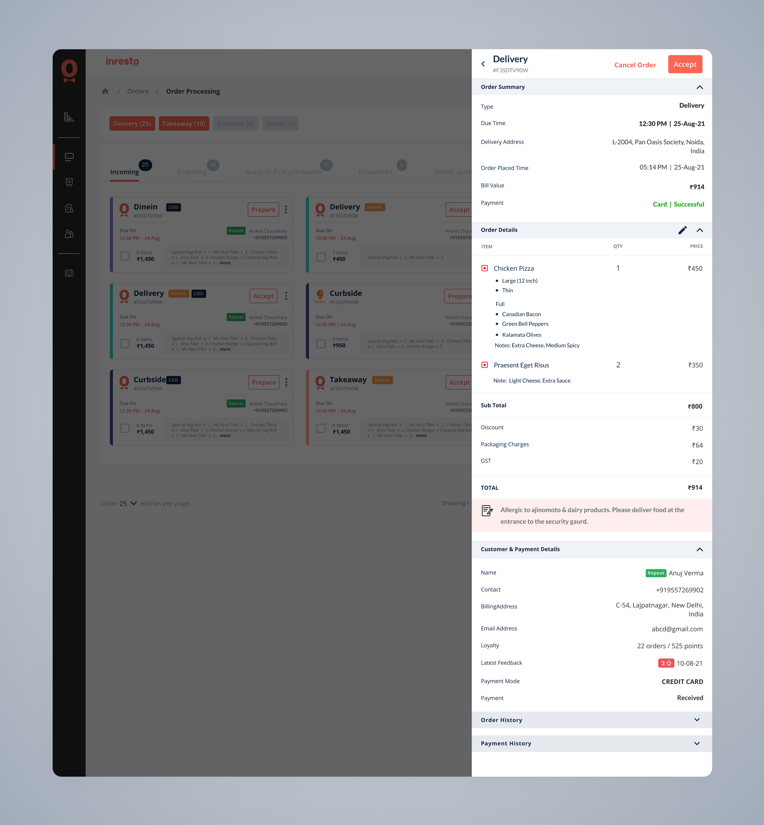
The Card
I started with the smallest functional unit of the system which was a card that contains all the crucial information about order. I wanted the card to be as valuable and informative as possible. Our users wanted a clear grid of cards, this was a constant thought in my mind while creating it.
Order Processing Dashboard
Let’s break down the dashboard one by one-
On the left we have 6 different menu items that would take us to different parts of the system (order history, settings etc.).
On top we have an outlet selector dropdown.
Next, we have the segregation part. There are multiselect tabs that show a grid of orders according to the selected tabs.
I figured out the lifecycle of an order from kitchen to delivery location. Using this information I divided the order lifecycle into 6 navigatable section-
Cancelled User can change the state of order using CTA’s on cards.
1️⃣ Incoming
2️⃣ Preparing
3️⃣ Ready to Pickup
4️⃣ Dispatched
5️⃣ Pick up/Delivered
6️⃣ Cancelled
Scroll to view the screen👇🏻

.gif)
.gif)